Wildside Press breaking into bookstores
Wednesday, July 12, 2006
posted by Leo Grin
 Print This Post

For a while now editor/publisher John Betancourt has been quietly preparing his company Wildside Press to move from the online world of print-on-demand into a more traditional business model that will put his books in every major bookstore. As anyone who has published knows, the hurdles in building the proper distribution channels for this are immense.
Well, it looks as if — after some test runs and months of nudging forward — the time has come for the Big Push. Paul Herman, editor of the Wildside Press series of Howard books entitled The Weird Works of Robert E. Howard, delivered the scoop on Dennis McHaney’s REH Inner Circle Yahoo! group (hat tip: Don Herron):
I’ve been informed by the gang at Wildside, as they are going to more nationwide distribution of the Weird Works set, they are changing the covers to better fit a “more modern” look…Its my understanding that this is just for the mass distribution paperbacks, so [there will be] changes in size, font, page count, etc.
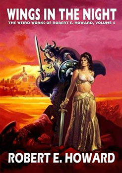
The new books for brick and mortar stores such as Barnes & Noble will be mass market paperbacks and sport covers by Ken Kelly, while the hardbacks sold off the Wildside website will continue to appear with Fabian covers.
I like the new look. One of the major faults with Wildside Press titles to my mind has always been the design. The worst have been plagued with garish or gaudy colors — shit brown, piss yellow — combined with sans serif fonts that scream out amateur outfit.
They have made strides in correcting this over the past year or two (I especially liked the layout for Gates of Empire), but even then the fonts on the side of the book have been bright yellow or white and sans serif, Arial or some similar font. With this new mass market design, we are finally seeing a look as professional as they come, one that can compete against any other book in the store.
I will say that I see nothing wrong with the Fabian covers. The Kelly one to my mind doesn’t look substantially more polished, especially at that smaller cropped size, and if the Fabian art had been surrounded by a similarly revamped design I think it would look almost as modern.
Incidentally, there are some nice Stephen Fabian Conan prints available here.